grid布局
说起布局
grid我相信重要程度比起flex不遑多让啊。除了兼容性方面,其余的方面都是很完美的。但是我相信随着技术的不断更替,兼容性已经不再是问题。那今天进让我们来看看grid到底能够干啥吧
本文意图不是想将 API 介绍清楚,如果想了解详细 API,请移步阮一峰老师 Grid 布局。 本文从实际的布局业务出发。告诉各位读者什么样的情况下,适合哪种 API
# 开始
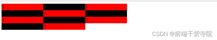
# 1. 如果实现多行多列网格布局呢???
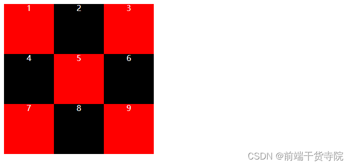
.container {
  display: grid;
  grid-template-rows: 100px 100px 100px;
  grid-template-columns: 100px 100px 100px;
}
1
2
3
4
5
2
3
4
5
- 主要是 API
display: grid。将布局设置为网格布局 - 同时通过属性
grid-template-rows,grid-template-columns设置网格的宽高 grid-template-rows主要是设置单个网格高度距离grid-template-columns设置单个网格宽度距离- 上述两个 API 的值 还可以设置百分比
- 设为网格布局以后,容器子元素(项目)的 float、display: inline-block、display: table-cell、vertical-align 和 column-*等设置都将失效
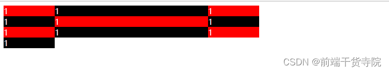
# 2. 如果设置属性grid-template-rows每个值都一样怎么办呢???
.container {
  display: grid;
  width: 300px;
  height: 300px;
  color: #fff;

  /* 如果觉得重复写太麻烦 可以使用repeat */
  grid-template-rows: repeat(3, 33.33%);
  grid-template-columns: repeat(3, 33.33%);
}
1
2
3
4
5
6
7
8
9
10
2
3
4
5
6
7
8
9
10
- 如果觉得每个值都是一样,可以使用 API
repeat。 函数传递的第一个参数是次数,就是重复展示的次数。第二个参数是设置的值
# 3. 如果单元格大小固定,容器大小不固定,想尽量多放,怎么办呢???
.container {
  display: grid;
  font-size: 4em;
  color: #ffffff;
  /* 函数repeat 第一个参数是循环的个数 设置auto-fill 表示自动填充 尽可能多放 */
  grid-template-columns: repeat(auto-fill, 210px);
}
1
2
3
4
5
6
7
2
3
4
5
6
7
- 我们可以在函数
repeat的第一个参数中设置属性auto-fill. 表示自动填充。尽可能的多放
# 4. 如果每列宽度显示长度是长比例的怎么设置呢???

.container {
  display: grid;
  color: #ffffff;
  width: 300px;
  font-size: 4em;

  /* 为了方便表示比例关系,网格布局提供了fr关键字 如果两列的宽度分别为1fr和2fr,就表示后者是前者的两倍*/
  grid-template-columns: 1fr 2fr;
  grid-template-rows: repeat(auto-fill, 100px);
}
1
2
3
4
5
6
7
8
9
10
2
3
4
5
6
7
8
9
10
- 为了方便表示比例关系,网格布局提供了
fr关键字(fraction 的缩写,意为"片段")。如果两列的宽度分别为 1fr 和 2fr,就表示后者是前者的两倍
# 5. 如果我想把fr跟像素 px 一起使用怎么办呢???
.container {
  display: grid;
  font-size: 4em;

  grid-template-columns: 150px 1fr 2fr;
}
1
2
3
4
5
6
2
3
4
5
6
- 通过上述实例代码
grid-template-columns: 150px 1fr 2fr;. 我们就可以发现其实像素跟fr是可以一起使用的,这样布局起来更加方便了
# 6. 如果我想将宽度设置在一个范围怎么办???
.container {
  display: grid;
  width: 400px;
  /* minmax()函数产生一个长度范围,表示长度就在这个范围之中。它接受两个参数,分别为最小值和最大值。 */
  grid-template-columns: 1fr 1fr minmax(100px, 1fr);
}
1
2
3
4
5
6
2
3
4
5
6
grid布局中提供了函数minmax。 该函数有两个值,一个最小范围的值,另一个最大范围的值。上述的实例中表示宽度是最小是 100px,最大是 1fr
# 7. 如果我想让浏览器自己决定长度怎么办???
.container {
  display: grid;
  color: #ffffff;
  width: 500px;

  grid-template-columns: 100px auto 100px;
}
1
2
3
4
5
6
7
2
3
4
5
6
7
- 我们可以将宽度设置成为
auto - 这种布局方式同样适合
两边定宽,中间自适应的布局
# 8. 如果我想设置网格间隙怎么办呢???

.container {
  display: grid;
  color: #ffffff;

  grid-template-columns: repeat(3, 100px);
  grid-template-rows: repeat(3, 100px);
  gap: 10px 10px;
}
1
2
3
4
5
6
7
8
2
3
4
5
6
7
8
- 可以设置属性
gap。 此属性是row-gap以及column-gap的合集
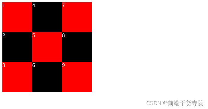
# 9. 如果我想指定展示的区域怎么办呢???

.container {
  display: grid;
  color: #ffffff;
  width: 300px;
  grid-template-areas:
    'a b c'
    'd e f'
    'g h i';
}
1
2
3
4
5
6
7
8
9
2
3
4
5
6
7
8
9
- 可以通过属性
grid-template-areas来显示区域
# 10. 如果我想修改展示的顺序怎么办呢??
.container {
  display: grid;
  color: #ffffff;

  grid-template-columns: repeat(3, 100px);
  grid-template-rows: repeat(3, 100px);
  /* 默认是row排序 可以设置column/ row dense */
  grid-auto-flow: column;
}
1
2
3
4
5
6
7
8
9
2
3
4
5
6
7
8
9
- 设置属性
grid-auto-flow来修改展示的顺序。默认是row - 分别是
column,row dense,column dense
# 11. 如果我想让一个单元格占据多列怎么办???
.container {
  display: grid;
  color: #ffffff;

  grid-template-rows: repeat(3, 100px);
  grid-template-columns: repeat(3, 100px);
  /* 设为row,表示"先行后列" */
  grid-auto-flow: row;
}
1
2
3
4
5
6
7
8
9
2
3
4
5
6
7
8
9
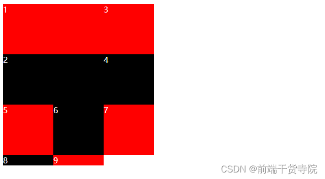
- 如果一个单元格占据了两个位置,而且排列顺序设置为
row.就会出现上面的情况。请看下个例子
# 12. 如果我想让一个单元格占据多列,但是尽量都占满该怎么办???
.container {
  display: grid;
  color: #ffffff;

  grid-template-rows: repeat(3, 100px);
  grid-template-columns: repeat(3, 100px);
  /* 设为row dense,表示"先行后列",并且尽可能紧密填满,尽量不出现空格。 */
  grid-auto-flow: row dense;
}
1
2
3
4
5
6
7
8
9
2
3
4
5
6
7
8
9
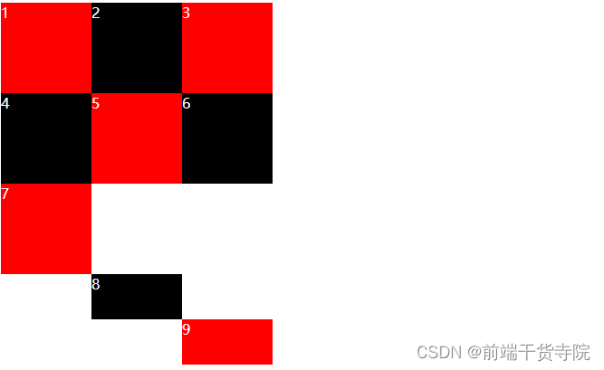
- 设置排列顺序
grid-auto-flow: row dense;可以保证先行后列,而且尽可能的不出现空格
# 13. 那我该怎么设置单元格内容对其方式呢??
.container {
  display: grid;
  color: #ffffff;
  font-size: 4em;

  grid-template-columns: 100px 100px 100px;
  grid-template-rows: 100px 100px 100px;

  /* 设置网格的对其方式 */
  /* justify-items: center;
        align-items: center; */

  place-items: center center;
}
1
2
3
4
5
6
7
8
9
10
11
12
13
14
2
3
4
5
6
7
8
9
10
11
12
13
14
- 属性
place-items可以设置单元格内对其方式。分别有start,end,center - 属性
place-items是justify-items以及align-items的缩写
# 14. 如果我想整个容器区域的对其方式怎么办呢???

.container {
  display: grid;
  color: #ffffff;
  height: 500px;

  grid-template-columns: repeat(3, 100px);
  grid-template-rows: repeat(3, 100px);
  place-content: center center;
}
1
2
3
4
5
6
7
8
9
2
3
4
5
6
7
8
9
- 通过属性
place-content,可以设置相对于整个容器的对其方式 - 属性
place-content是justify-content以及aligns-content的缩写 - 分别有值
start | end | center | stretch | space-around | space-between | space-evenly;
# 15. 如果某个单元格,放置到网格外面怎么办呢???
.container {
  display: grid;
  color: #ffffff;

  grid-template-columns: repeat(3, 100px);
  grid-template-rows: repeat(3, 100px);

  grid-auto-rows: 50px;
}
div:nth-child(8) {
  grid-row-start: 4;
  grid-column-start: 2;
}

div:nth-child(9) {
  grid-row-start: 5;
  grid-column-start: 3;
}
1
2
3
4
5
6
7
8
9
10
11
12
13
14
15
16
17
18
2
3
4
5
6
7
8
9
10
11
12
13
14
15
16
17
18
grid-auto-columns属性和grid-auto-rows属性用来设置,浏览器自动创建的多余网格的列宽和行高
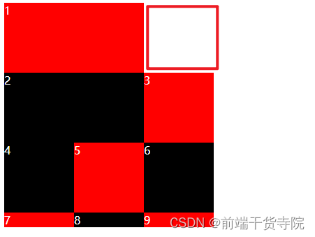
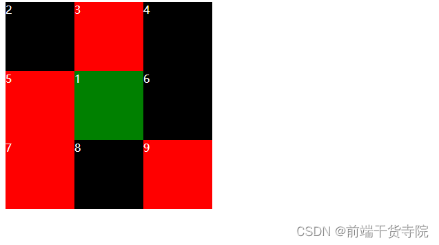
# 16. 我想指定某个单元格显示的位置怎么办???
.container {
  display: grid;
  color: #ffffff;

  grid-template-rows: repeat(3, 100px);
  grid-template-columns: repeat(3, 100px);
}
.container div:nth-child(1) {
  background: green;
  grid-column-start: 1;
  grid-column-end: 3;
  grid-row-start: 2;
  grid-row-end: 4;
}
1
2
3
4
5
6
7
8
9
10
11
12
13
14
2
3
4
5
6
7
8
9
10
11
12
13
14
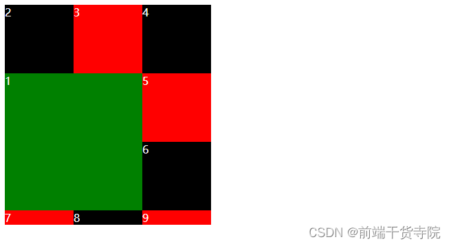
- 在网格布局中存在网格线。nn 的网格中存在(n+1)(n+1)条网格线
- 属性
grid-XXX-start表示网格线的开始位置 - 属性
grid-XXX-end表示网格线的结束位置
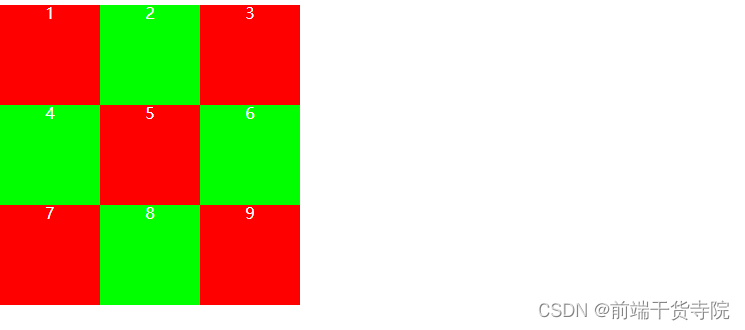
# 17. 如果想在网格布局中将某个单元格展示在单独的位置怎么办???
.container {
  display: grid;
  color: #ffffff;

  grid-template-rows: repeat(3, 100px);
  grid-template-columns: repeat(3, 100px);
  grid-template-areas: 'a b c' 'd e f' 'j g h';
}
.container div:nth-child(1) {
  grid-area: e;
  background: green;
}
1
2
3
4
5
6
7
8
9
10
11
12
2
3
4
5
6
7
8
9
10
11
12
- 首先设置展示的区域
grid-template-areas: 'a b c' 'd e f' 'j g h'; - 其次设置某个单元格单独显示的区域
grid-area: e;
# 18. 我想给某个单独格单独设置对其方式
属性
place-self可以设置。跟前文介绍的place-items效果保持一致。前者写在单个单元格,后者写在容器上